Color trends are always evolving. In the last few years, we have seen things shift from loud, bright hues to more calming and muted colors. Pantone 2021 Color of the Year, is a mix of both. They announced two trend colors – a dull, classic gray (Pantone Ultimate Gray) and a bright lemon yellow (Pantone Illuminating).
Whether it’s bright or muted hues, the colors you choose along with the printing process, paper, inks, and finishes can impact the final product and costs. As designers work on specific projects from brochures, labels, posters or something else, always talk to your printer early on in the project.
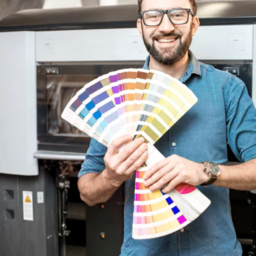
Jobs will run more smoothly when designers share concepts with their printers before submitting files. This is particularly true for complex projects or those with intricate details. Color management can fall into this category, given the choice of printing technology available today. Offset, digital, and inkjet technologies all have their quirks for handling and executing color. Design decisions may hinge on the type of press on which your print provider will run the job.
When making color choices for offset printing, consider the following items – inks, paper, substrates, and number of colors – to ensure you are using color cost-effectively without reducing visual appeal.


SPOT COLORS VS PROCESS COLOR
To achieve brilliant, vibrant, or fluorescent colors that scream for attention, it’s often necessary to run spot colors, which can significantly add to the cost of a job. Designers sometimes believe they must always use spot colors to produce a specific color, but that’s not true. It may be possible to create the preferred effects affordably with process colors.
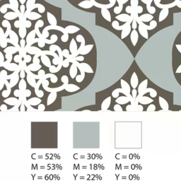
Presses print with four process colors: cyan, magenta, yellow, and black (CMYK). Printers can create almost all colors by mixing these four inks on the press in varying ratios. Printers create entire books, magazines, and brochures with only CMYK.
Sometimes, though, a job needs an exact, special color. That’s when you specify a spot color. Spot colors come premixed from the ink manufacturer, based on industry standard color systems like the Pantone Matching System (PMS). A spot color may be necessary when you must adhere to strict brand identity requirements or when very high production values are critical. Printers may use a fifth color for specialty shades, like a fluorescent or neon, they cannot reproduce well with CMYK. Other finishing options, like spot varnishes, specialty inks, or metallic inks can also count as spot colors.
Ink manufacturers charge more for PMS color inks. But more significantly, adding spot colors requires imaging extra printing plates, which means more time and supplies for each spot color.
In offset printing, printers must make a plate for every color, so every job requires at least four printing plates. If you run two spot colors, printers must etch two more plates for the job.
You need plates for every imposition layout, also called a signature. Let’s say you’re producing a 32-page brochure, which the printer will run in four signatures of eight pages each. For CMYK, each signature needs four plates, a total of sixteen to print the job. If you add two spot colors to your project, the printer will charge for making eight more plates.
Costs can escalate in this scenario. If your project doesn’t require eye-popping treatments and loud colors, it’s highly likely you can execute your design vision using the standard four-color process and keep your costs down.
INK CONSUMPTION, SPECIALTY INKS AND FINISHES
It may surprise you to know that ink consumption is usually a small part of total printing costs. In theory, a brochure, poster or label with less ink coverage will lower ink usage and therefore reduce ink costs. Unless you’re executing long runs, the amount of ink consumed will not impact the price of a print project. Usually, it’s not enough to affect the colors you choose for your job. An exception is the use of specialty inks and finishes which almost always affect project costs.
Specialty inks include fluorescent, pearlescent, thermochromic, photochromic, metallic, and scented inks. These treatments, along with finishes like spot varnish, can add dramatic effects to your project, but expect higher production costs. The materials are more expensive than standard inks and working with them may be more difficult. Printers may build in a higher spoilage rate and account for extra set-up and run time when they compute prices for projects that feature specialty inks and finishes.

Fluorescent ink sometimes requires an extra pass to achieve the desired color strength and coverage. That adds to costs as well. Fluorescents are also prone to “chalking”, where the pigment separates from the substrate and flakes away. Your printer may recommend adding varnish to protect the surface, depending on how much the piece is expected to be handled.
Metallic inks contain actual metal flakes. They too are prone to chalking, so a protective varnish may be recommended. Metallic inks look better on coated stock because the ink isn’t absorbed into the paper, which dulls the effect of metallic ink on uncoated stock. This is another factor that affects the overall cost of the project. Extra passes won’t add to the shine of metallic ink, but may be necessary, depending on coverage.
Designers should confer with the printer in advance to understand their processes and capabilities. Designing for features like spot varnish will require an extra layer in your design. The printer will estimate the cost of your job and offer guidance about how to set up your files to get the results you want.

PAPER
Paper is, by far, the costliest supply element of any print job. It can have a significant impact on the overall cost of a project or the way you design a project to produce desired colors.
Paper grades absorb ink differently, based on their weight and surface treatment. Fine printing paper will be coated or uncoated. Coated paper has a very smooth matte, glossy, or satin finish, while uncoated paper has a more unfinished texture and duller appearance. Any color, even one you choose from the Pantone book, will look different on each type of paper.
Coated paper reflects more light. This makes colors appear more intense and saturated. Light reflection differs, depending on the coating. Uncoated paper is less reflective, so colors have a more muted appearance.
Paper also comes in various shades of white, from warm to bluer, cooler, tones, and in different grades of brightness. Brightness is the volume of light reflected off the paper. Paper manufacturers measure brightness on a scale from one to one hundred. High-end papers are in the mid-90s. The brighter the sheet, the more light it reflects, and the brighter the colors will appear.
Uncoated paper is less expensive than coated paper, so if a muted palette is what you’re after, uncoated sheets will achieve the results you want at a lower price point. You may also want to consider the shade of white or choose a different colored paper altogether to keep colors in the desired gamut.
Color is compelling and evocative, and pretty wonderful. Color management can be fascinating, but highly complex. With forethought and planning about color in the design process, your printer can produce spectacular results at a reasonable cost.
Join the Color Collective
Registration is FREE and only takes a moment
- Latest industry advice
- News, Article, Technology
- Events & Awards,
- And lots more...
Related Posts

Data, as they say, is king. But data, in its raw form with lines of numbers, can be challenging for readers to absorb and process, especially if you want them to discern key themes or trends…

Most of us are now working virtually, and those who have children find themselves now homeschooling as well. If you are looking for an art activity, coloring eggs might be on your list this week…
There are several color languages and picking the right one in a design file is critical to achieving the desired color in the final product. Knowing which color language to…

Fonts and typefaces have personality. Knowing how to use them in variable data printing can make your message stand out.

10 things a designer should ask their printer before starting a project – colors, paper, proofing, finishing, services and more.

Red has a strong, forceful impact on our brain and emotions, but why and how does one produce this the poisonous red.

Everyone has access to design tools; that doesn’t make everyone a smart designer. Creatives need to learn today’s technology to make themselves more valuable.

I do a lot of branding work with clients and talking about color can be tricky. It’s important to get it right – from the brand logo to the product color to the packaging.

Red and blue don’t make violet. Red, green and blue make white, and the way we teach color needs to support the technology and world we live in. One of RGB and CMYK.
Learn how marketers and designers can take advantage of the latest printing technologies while delivering designs print companies can accurately reproduce
Everyone’s eyes perceive color a little differently, which can make working with color a challenge. However, if you can find a common color language to communicate, the process becomes a whole lot easier.

Adobe Illustrator’s Color Themes can help marketers and graphic designers choose the right color scheme for direct mail and transactional printing.

We share the history of Halloween colors and why this mood board is such a challenge for suppliers.
Creating print-friendly PDFs ensures a smooth production process. But many factors can throw your design off track. Keep these tips in mind.

Data, when used for marketing and design purposes, can increase customer engagement and responses. Learn how to design for variable data printing.
