
To avoid print production problems here are 5 things to check before you send a design file to your printer.
You spent countless hours working on a design and getting approvals. Now it’s time to send it to your printer. You can’t wait to see the proof and eventually the final product. But wait, your printer calls and says there is an issue with the file and they can’t print.
Designers use many different programs, file formats, element types, drawing styles, layers, image resolution, color spaces and font types to create beautiful designs. But beware, there are many ways to create deadly files which halt the production process and make files unprintable.

PDF files which can get VERY large, can be a particular challenge. PDFs that include variable data and images, have more items to process on a digital press than with pre-production for conventional offset. If you are a freelance designer, corporate designer or work for an agency, talk to someone in the print organization who will receive the files to understand the capabilities and limitations of the specific press. This will help you ensure the file can be processed efficiently and produced to your expectations – before you send it.
To avoid print production problems, here are 5 things you should check in your design file.

1. DON’T RENAME PANTONE SELECTED SPOT COLORS!
Avoid selecting a spot Pantone color in the Adobe Pantone Color Library and then renaming it. If you call Pantone 485, Grandma’s Red Dress, the printer will not know the name and it may not be resolved to the right process ink recipe. Many print production devices have look up tables which will assign the PMS to the closest process values to be printed. It can only assign the right ink recipe if the name finds a match. Check your file to make sure you have not renamed your colors.
2. DO YOU HAVE THE CORRECT COLOR SPACE ASSIGNED TO EACH ELEMENT?
Do not, and I stress, DO NOT create logos or vector elements in the RGB color space. Doing this can completely confuse a digital process leaving everyone scratching their heads. It is best to use a CMYK color space. Remember that RGB is best left for images only.

3. HAVE YOU PROPERLY SAVED LOGOS AND ELEMENTS?
When creating CMYK vector elements (never RGB- read #2 again) in Adobe Illustrator or InDesign keep the element as vector. Avoid saving the element and placing it into Photoshop just to save it again as a .jpeg. Its important to remember that .JPG files are resolution dependent and will create color shifts within solid colors. PMS spot colors used in a vector image will no longer be a spot assignment in the jpeg but will convert to CMYK values. Save your logos and elements as vectors! Plus, this will create smaller file sized when preparing for print.
4. ARE YOUR PHOTOSHOP IMAGES OR BITMAPS SIZED CORRECTLY?
Did you up-size a bitmap picture more than 200%? If so, this will cause issue. Even though Photoshop allows you to increase the image size of a bitmap, it does not make a clean pixel transition when the size increases. Most of the time you are just increasing the image processing file size with not much upside. The downside – it leaves your image grainy and pixelated. It is recommended that you start with 100% or larger of the file size needed for the design.
Also, ask your print provider about the preferred resolution for the production device. The image you purchased or created may be 1200 dpi, but it may only be printed at 600 or even 300 dpi. Prepare the bitmap images properly to keep the file size and processing time efficient.
When masking areas within a bitmap, be sure to add pixel blur when knocking out a background or merging images. If a jagged edge is left behind, some print production devices will make this rough edge more prominent. Remember to smooth out your edges when masking.

5. DO YOU HAVE TRANSPARENCY ELEMENTS ON BITMAPS?
Transparency elements, when added to bitmaps, should be flattened into one complete image within Photoshop or while processing to a press ready PDF file previous to sending to an inkjet device. If you Leave transparency layers for the digital device’s RIP to process can create unexpected color conversion.
FINAL THOUGHTS
When you finalize a file for a printer, there is more at stake than just a pretty / compelling design. Files that are inefficient or worse (just wrong) will stop your project in its tracks. It will cost you added time and money.
When ever possible, designers should work with their print provider in advance to understand how best to optimize a file for production. This will make you and your printer more successful.
Join the Color Collective
Registration is FREE and only takes a moment
- Latest industry advice
- News, Article, Technology
- Events & Awards,
- And lots more...
Related Posts

Most of us are now working virtually, and those who have children find themselves now homeschooling as well. If you are looking for an art activity, coloring eggs might be on your list this week…

There are several color languages and picking the right one in a design file is critical to achieving the desired color in the final product. Knowing which color language to…

Color choices affect printing costs. To use color cost-effectively in design, consider inks, paper, substrates and number of colors.

10 things a designer should ask their printer before starting a project – colors, paper, proofing, finishing, services and more.

Red has a strong, forceful impact on our brain and emotions, but why and how does one produce this the poisonous red.

Everyone has access to design tools; that doesn’t make everyone a smart designer. Creatives need to learn today’s technology to make themselves more valuable.
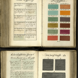
Color reference guides are an essential tool for designers but how did Pantone, Munsell, and CSI get started?

I do a lot of branding work with clients and talking about color can be tricky. It’s important to get it right – from the brand logo to the product color to the packaging.

Each holiday season, my kids and I do a new puzzle. It’s a great way to spend quality time with family. We like 1,000-piece puzzles with an intricate pattern that will keep us up until the wee hours.

Red and blue don’t make violet. Red, green and blue make white, and the way we teach color needs to support the technology and world we live in. One of RGB and CMYK.
Learn how marketers and designers can take advantage of the latest printing technologies while delivering designs print companies can accurately reproduce
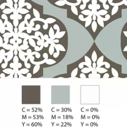
Everyone’s eyes perceive color a little differently, which can make working with color a challenge. However, if you can find a common color language to communicate, the process becomes a whole lot easier.

Adobe Illustrator’s Color Themes can help marketers and graphic designers choose the right color scheme for direct mail and transactional printing.

We share the history of Halloween colors and why this mood board is such a challenge for suppliers.
Creating print-friendly PDFs ensures a smooth production process. But many factors can throw your design off track. Keep these tips in mind.
